overview
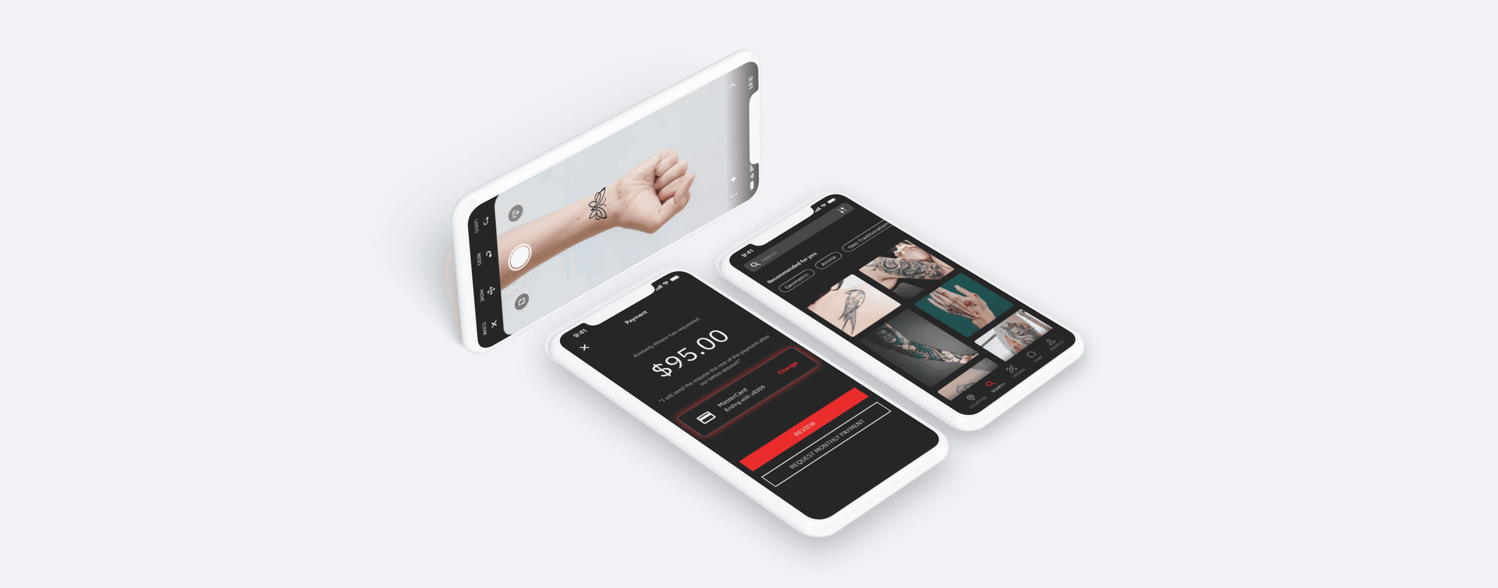
Inklink provides a social media aspect for users to book tattoo artists as well as provide a platform for both customers and artists to virtually design tattoos by integrating an AR system.
problem
Tattoo enthusiasts need a hub for artists and customers to share ideas, collaborate on designs, and easily book appointments.
During user interviews with artists and customers, many participants highlighted challenges in the tattoo process caused by switching between multiple applications. Customers reported it would be easier to design tattoos with artists before the day of the appointment. This raises a question:
HMW help customers easily find artists and collaboratively design tattoos?
finding and booking the right artist
Customers can use the filtered search to find an artist or studio that meets their tattoo needs, browse portfolios, and book their preferred artist.


easily customize tattoos in real time
Artists and customers can collaborate in real-time via a tattoo AR tool, enabling pre-planning and reducing cognitive load.
simple messaging system paired with payment options
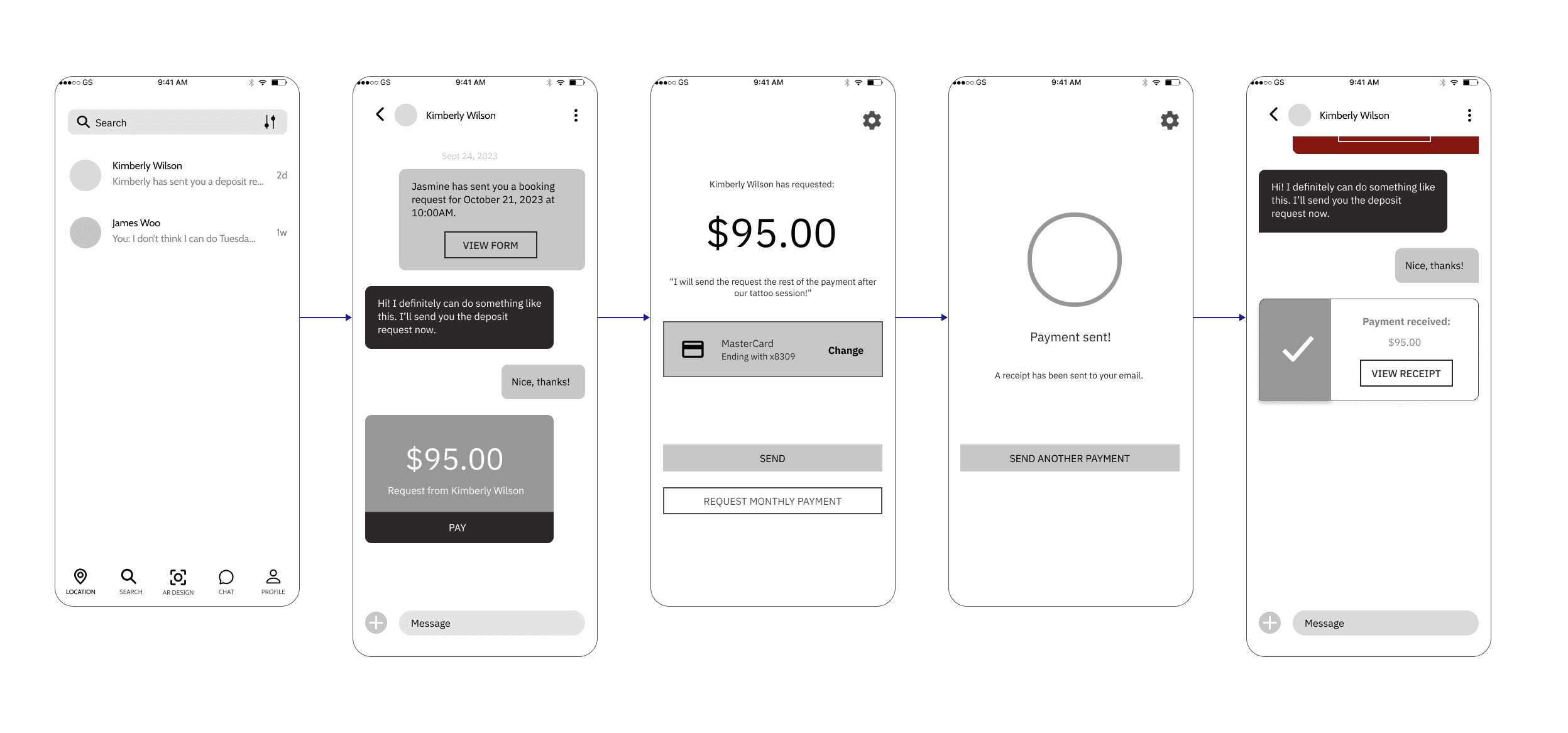
Customers and artists can easily communicate via the chat function to send messages and payments.


keep track of appointments with artist mode
As a business/artist exclusive function, artists can view their bookings and the details within the calendar. This helps artists keep their day organized.
The process
analyzing the competition
market research revealed similar feature sets implemented
I’ve researched some top competitors in the marketplace in order to find similarities — then compared and contrasted to find the most important aspects that would have led to successful tattoo experiences.
I had to ask myself, how could I create an opportunity to present Inklink in a unique way?
understanding our target users
interviews and survey responses shared key issues to their tattoo design process
The main aspects I wanted to discover were how artists are found by customers and what the design collaboration process is like for both parties. There were a total of 6 customers and 2 artists.
defining the personas
Combining our key insights into two personas - artist and customer


translating persona needs into concept
Jamie and Peter both have similar challenges that can grouped into common themes: connecting reputable artist with client, the need for easy collaboration on tattoo designs, and lack of convenience. Keeping these findings in mind, I took into how the challenges can affect the design decisions.

feature prioritization
I wanted to focus on features that would were low effort but had high impact as well as a few features that were high impact and high effort. The features that ultimately made it on the app were features that could relate back to our personas' pain points.

site mapping
For the customer site map, I focused primarily on implementing features that crafted a streamlined and user-friendly experience while providing familiar systems to use. My main goal for these features was to provide the customer an engaging way to find, book, and work with their chosen artist.

wireframing our early concepts
With the task flows in mind, I sketched ideas to clarify the screen layout. I explored solutions that align with user goals while maintaining a familiar, user-friendly interface. To support an AR design collaboration system, I chose a mobile app for its ease of camera use and accessibility.
i want to find and book an artist.


i want to interact with the artist/customer.

i want to visually collaborate.


iterations from usability testing
In response to the feedback received from the usability testing, I took the most common and prominent pain points and reiterated them.

Users experienced issues with the Body Placement model as it was too small to see, which may cause accessibility issues.
Zoom-in element included to enhance visibility.
It was not clear what the stylized filter icon meant. In order to locate the filtering aspect better, the icon was changed to something more familiar.

the final screens

Homepage

Search with Filter

Search Results

Artist's portfolio/page

Set Date

Booking Receipt

AR tool

Upload Design

Customer POV AR Tool

Artist Collaboration

Direct Messaging

Message Artist

Booking

Booking Details
key learnings
tech for good
Building the AR system was a valuable learning experience, prompting me to explore methods for seamlessly applying tattoos onto real people. Due to this project being only a concept, I was able to explore more ambitious features.
user-centered design adjustments
Referencing user-research and survey results, I uncovered a gap between my expectations and necessary elements needed by users. Previously, I was unfamiliar with artists’ workflows, but I now understand that their primary focus isn’t the tattoo session itself but the extensive preparation involving devices (sketching on tablets, texting customers, etc.)
if there was more time...
tech optimization
In order to streamline the process even more, I would have optimized Inklink for tablets because a large amount of artists use tablets to draw their tattoo designs.
artist focused
A lot of the solutions provided focused more so on the customer's POV, given that most of the user research participants were customers. Gathering a larger tattoo artist participant pool could have lent for a deeper understanding to the artists' user journey.


